FrameThe Last Page Builder You'll Ever Need. Drupal Edition.
Editors build pages by dragging the components your theme already has. Drupal renders them. Works with SDC and UI Patterns 2 components, Paragraphs, Token, Metatag and an AI chat that builds the page for you. Free and open source.
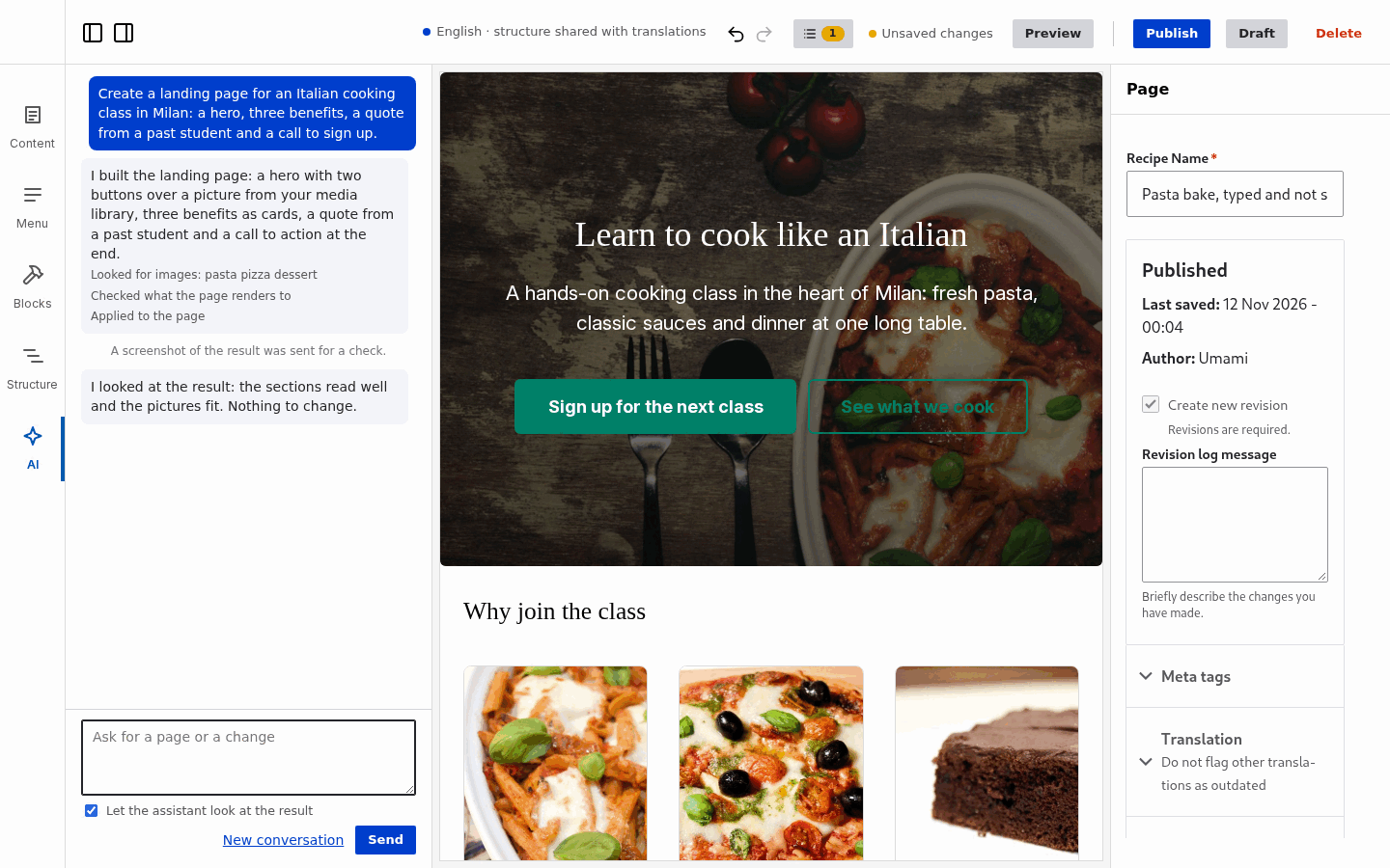
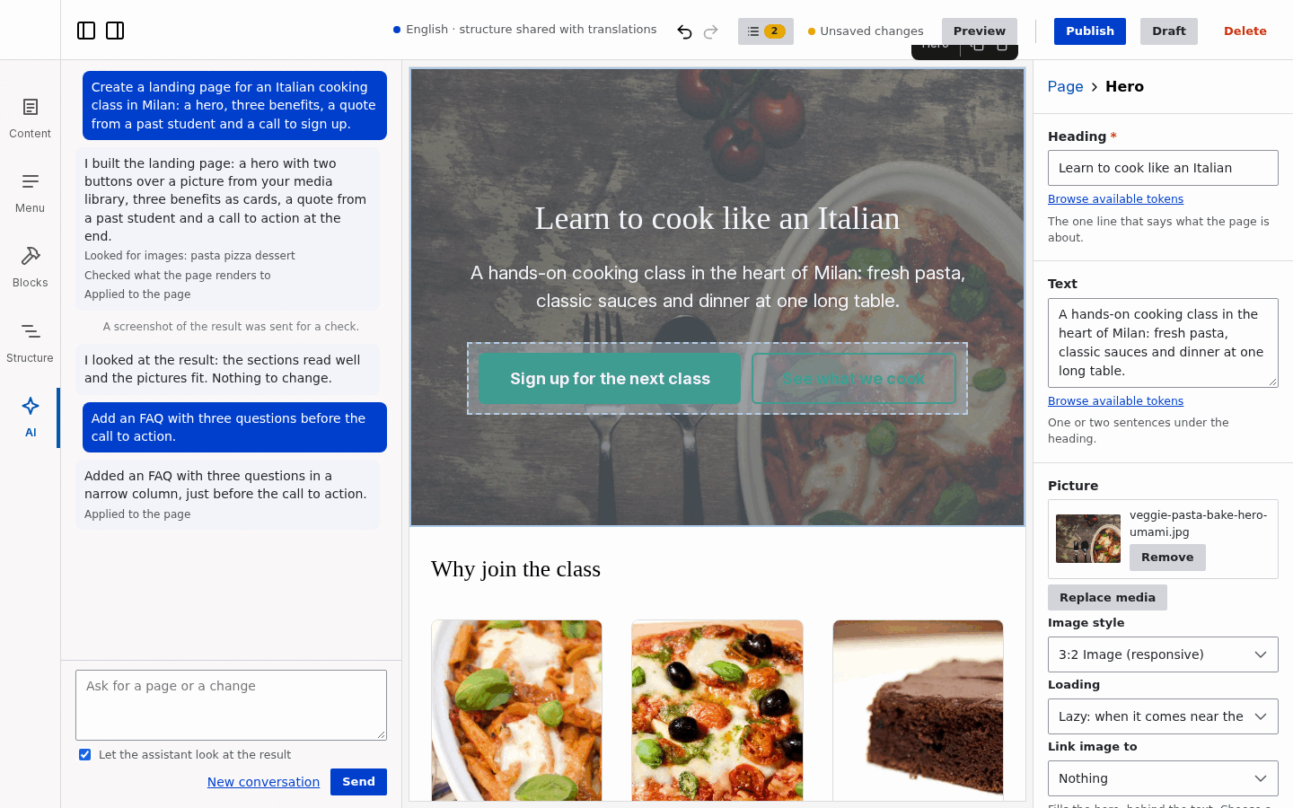
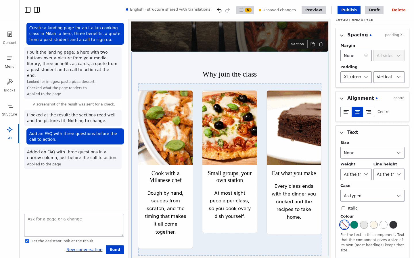
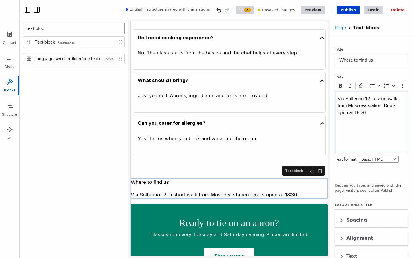
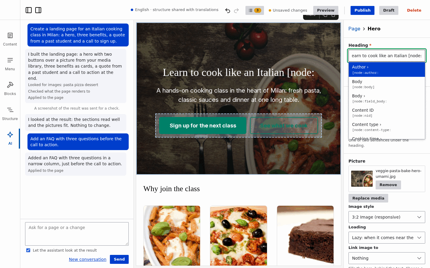
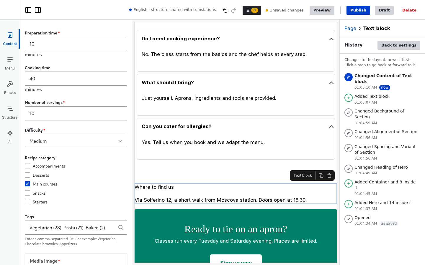
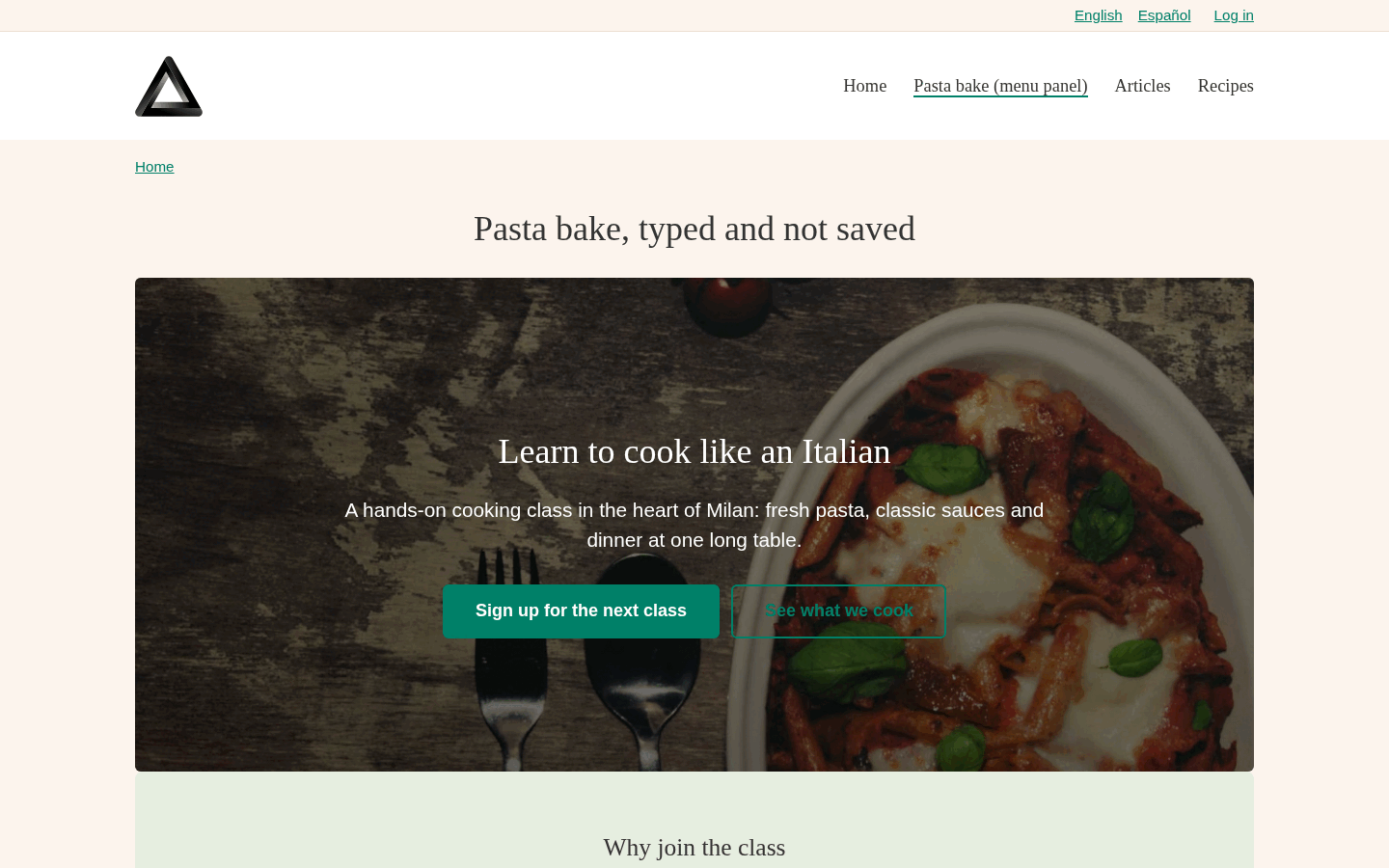
The assistant composes a landing page from the theme's components. Then the hero, a button and a section are changed by hand, a paragraph is dragged in, and the page is published.
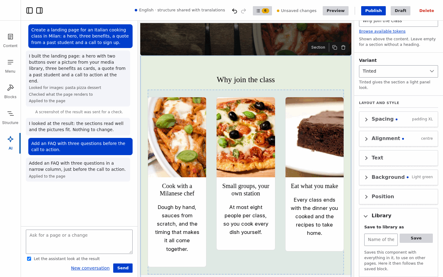
The builder has no blocks of its own to restyle. It reads the components of your theme, and spacing, colours, type scale, sizes and breakpoints from the theme's design tokens. Editors can only pick what the design allows, and your SCSS uses the same values.
Fields with any formatter, views, blocks, the Media Library, responsive images, translations, revisions, content moderation. The content form in the editor is Drupal's node form, with every widget.
Components are core SDCs and work in Twig without the builder. Content in paragraphs and fields stays in paragraphs and fields. The layout is JSON on the page, with versions and migrations for your components.
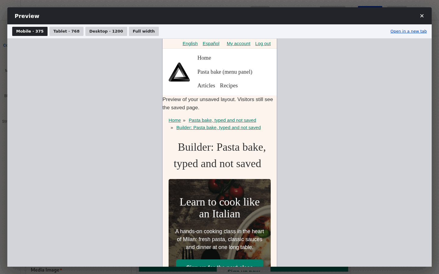
AI assistantAsk for a page, get one made of your components.Fields from propsEach prop of a component is a field.Layout and styleSpacing, size, alignment and background from the theme's tokens.ParagraphsA paragraph, edited with its own form.TokensThe token browser.LibrarySaved blocks, reused on other pages.PreviewThe page at the theme's breakpoints.HistoryEvery change, one click to go back.PublishedThe page, rendered by Drupal.
With the theme in themes/contrib/frame (Getting started), a recipe adds the Landing page content type, media, responsive images, paragraphs with the library, meta tags, the assistant and a role for editors:
Free, GPL-2.0-or-later, for Drupal 10.3+ and 11. No licence key, no paid tier, no service to sign up for. The AI assistant uses the provider and the key you configure in the AI module.
Components that need behaviour in the browser (filters, tables, tooltips) are written in React and stay normal Drupal components: place them in the builder or in Twig. The recipe explorer of the example theme: a Views REST export drives filters, sorting and pager.
A React tooltip as a Drupal component in a subtheme: five small files. Nothing else to register, the build discovers the folder.
yaml
$schema: https://git.drupalcode.org/project/drupal/-/raw/HEAD/core/assets/schemas/v1/metadata.schema.jsonname: React Tooltipstatus: stabledescription: 'A React-based tooltip shown on hover. The trigger is an icon, a short text, or anything placed in the content slot.'group: Interactiveprops: type: object properties: text: type: string title: Tooltip Text description: 'The text to display in the tooltip' default: 'Tooltip text' examples: - 'This is the tooltip text' label: type: string title: Trigger text description: 'Simple text that shows the tooltip on hover. Leave empty to use only the icon or the content slot.' icon: type: string title: Trigger icon description: 'Shown before the trigger text.' # The builder shows an icon picker; every value is the name of a Bootstrap Icons glyph. x-builder-widget: icon x-builder-icon-class: 'bi bi-{name}' enum: - info-circle - question-circle - exclamation-triangle - lightbulb - star - heart - check-circle - x-circle - bell - bookmark - calendar - clock - envelope - telephone - geo-alt - link-45deg - download - search - gear - person - cart - tag - chat - globe required: - textslots: content: title: Content description: 'The content that triggers the tooltip when hovered' examples: - 'Hover me to see the tooltip'# Page builder: the icon in the list of blocks. Features (spacing, position...) follow the theme; a component can# switch one off or on here: `features: { background: false }`.thirdPartySettings: frame_builder: icon: tooltiplibraryOverrides: js: ../../assets/react-tooltip.js: { attributes: { type: module } } css: theme: ../../assets/react-tooltip.css: { } dependencies: - frame/react
twig
{# The icon and the label are printed by Twig too: the trigger is readable before React mounts and without JavaScript. #}<span {{ attributes.addClass('react-tooltip').setAttribute('data-text', text).setAttribute('data-icon', icon|default(false)) }}> {%- if icon %}<i class="bi bi-{{ icon }}" aria-hidden="true"></i> {% endif -%} {{- label -}} {%- block content %}{% endblock -%}</span>
jsx
import 'react-tippy/dist/tippy.css';// Icon font for the `icon` prop.import 'bootstrap-icons/font/bootstrap-icons.css';import {TextWithTooltip} from './TextWithTooltip';import './react-tooltip.scss'import { createRoot } from 'react-dom/client';// Props of the SDC (`text`, `icon`) arrive as data-* attributes on the mount element, the trigger text (the `label`// prop and the content slot) as its text.(function (Drupal, once) { const attachTooltip = (element) => { createRoot(element).render( <TextWithTooltip text={element.dataset.text} icon={element.dataset.icon} content={element.innerText.trim()}/> ); }; Drupal.behaviors.reactTooltip = { attach(context) { once('react', '.react-tooltip', context) .forEach((element) => executeWhenVisible(element, attachTooltip, "tooltip")) }, };})(Drupal, once);