
Tooltip: the smallest component
components/react-tooltip. Wraps the page title in a react-tippy tooltip. It is the minimal reference for the pattern.
Files
react-tooltip/
  react-tooltip.component.yml     # prop `text`, slot `content`, libraryOverrides
  react-tooltip.twig              # <span class="react-tooltip" data-text="..."> + slot
  index.jsx                       # behavior: reads data-text and innerText, renders TextWithTooltip
  TextWithTooltip.jsx             # <Tooltip html={...}>{content}</Tooltip>
  react-tooltip.scss              # Umami look for the bubble
  __tests__/react-tooltip.test.js # snapshot test
Full source
That is the whole component. Click the tabs.
yaml
$schema: https://git.drupalcode.org/project/drupal/-/raw/HEAD/core/assets/schemas/v1/metadata.schema.json
name: React Tooltip
status: stable
description: 'A React-based tooltip component that displays helpful text on hover.'
group: Interactive
props:
  type: object
  properties:
    text:
      type: string
      title: Tooltip Text
      description: 'The text to display in the tooltip'
      default: 'Tooltip text'
      examples:
        - 'This is the tooltip text'
  required:
    - text
slots:
  content:
    title: Content
    description: 'The content that triggers the tooltip when hovered'
    examples:
      - 'Hover me to see the tooltip'
libraryOverrides:
  js:
    ../../assets/react-tooltip.js: { attributes: { type: module } }
  css:
    theme:
      ../../assets/react-tooltip.css: { }
  dependencies:
    - react_scaffold/react
twig
<span {{ attributes.addClass('react-tooltip').setAttribute('data-text', text) }}>{% block content %}{% endblock %}</span>jsx
import 'react-tippy/dist/tippy.css';
import {TextWithTooltip} from './TextWithTooltip';
import './react-tooltip.scss'
import { createRoot } from 'react-dom/client';

// Props of the SDC (e.g. 'text') arrive as data-* attributes on the mount element.
(function (Drupal, once) {

  const attachTooltip = (element) => {
    createRoot(element).render(
      <TextWithTooltip text={element.dataset.text} content={element.innerText}/>
    );
  };

  Drupal.behaviors.reactTooltip = {
    attach(context) {
      once('react', '.react-tooltip', context)
        .forEach((element) => executeWhenVisible(element, attachTooltip, "tooltip"))
    },
  };
})(Drupal, once);
jsx
import { Tooltip } from "react-tippy";

export const TextWithTooltip = ({ text, content }) => (
  <Tooltip
    html={<span className="react-tooltip__text">{text}</span>}
    className="react-tooltip__container"
    position="right"
    delay={100}
    animateFill={false}
  >
    {content}
  </Tooltip>
);
scss
.react-tooltip {
  margin-left: .4rem;
  margin-right: .4rem;

  &__container {
    display: flex;
    max-width: 20rem;
    line-height: 1.5;
    padding: .5rem;
  }
}

// Umami look for the react-tippy bubble.
.tippy-popper .tippy-tooltip.dark-theme {
  background-color: #008068;
  font-family: "Source Sans Pro", Verdana, sans-serif;
  font-size: .95rem;
  border-radius: .35rem;
  box-shadow: 0 4px 12px rgba(0, 0, 0, .25);

  .tippy-arrow {
    border-top-color: #008068;
    border-bottom-color: #008068;
    border-left-color: #008068;
    border-right-color: #008068;
  }
}
Used from PHP
react_scaffold.theme wraps the page title in the component, so every page title gets the tooltip:
php
$variables['title'] = [
  '#type' => 'component',
  '#component' => 'react_scaffold:react-tooltip',
  '#props' => ['text' => 'Tooltip text'],
  '#slots' => ['content' => $title],
];
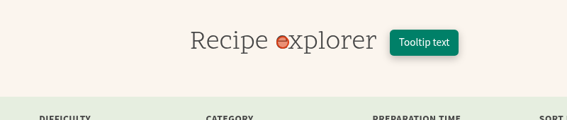
Hover the title on /recipe-explorer to see it:
react-tippy
animateFill={false} is set because tippy's fill animation paints a dark circle over a themed bubble background.