
Node list: React table with Drupal ajax inside
components/node-list in the frame_demo subtheme (examples/frame_demo/), page /node-list. Shows how React and Drupal's own ajax/dialog system live together.
Parts
- View
content_rest(config/optional/views.view.content_rest.yml): Better REST export at/api/nodewith an exposed Content type filter and a Created sort, plus a Page display at/node-listwith a template that mounts the SDC. - Component: rsuite
Table,SelectPickerandForm. Columns are generated from the keys ofrows[0]. A column is sortable if its key is inexposed_sorts[].field_identifier. - HTML cells: the view's
operations(dropbutton) andnothing(custom text with ause-ajaxlink) fields are HTML strings. The cell renders them withrawHtml(row[col]), which also attaches Drupal behaviors, see Ajax. - Look:
node-list.scssthemes rsuite with Umami's colors and fonts through rsuite's CSS variables.
jsx
<Cell rowKey="nid" dataKey={col}>{(row) => rawHtml(row[col])}</Cell>yaml
# node-list.component.yml, libraries needed by the HTML inside the cells
libraryOverrides:
  dependencies:
    - frame/react
    - frame/react-api-client
    - core/drupal.ajax
    - core/drupal.dropbutton
Full source
yaml
$schema: https://git.drupalcode.org/project/drupal/-/raw/HEAD/core/assets/schemas/v1/metadata.schema.json
name: Node List
status: stable
description: 'A React-based component that displays a list of nodes with theme variants.'
group: Content
props:
  type: object
  properties:
    endpoint:
      type: string
      title: Endpoint
      description: 'API endpoint for fetching node data'
      default: '/api/node'
      examples:
        - '/api/node'
    variant:
      type: string
      title: Theme Variant
      description: 'Visual theme for the component'
      default: 'light'
      enum:
        - 'light'
        - 'dark'
      meta:enum:
        light: Light
        dark: Dark
      x-translation-context: Theme variants
      examples:
        - 'light'
        - 'dark'
  required:
    - endpoint
# Page builder: the icon in the list of blocks.
thirdPartySettings:
  frame_builder:
    icon: table
libraryOverrides:
  js:
    ../../assets/node-list.js: { attributes: { type: module } }
  css:
    theme:
      ../../assets/node-list.css: { }
  dependencies:
    - frame/react
    - frame/react-api-client
    - core/drupal.ajax
    - core/drupal.dropbutton
twig
<div {{ attributes.addClass('node-list').addClass('node-list__' ~ variant).setAttribute('data-endpoint', endpoint).setAttribute('data-theme', variant) }}></div>jsx
import {NodeList} from './NodeList';
import './node-list.scss'
import { createRoot } from 'react-dom/client';

(function (Drupal, once) {
  const attachNodeList = (element) => {
    createRoot(element).render(
      <NodeList endpoint={element.dataset.endpoint} theme={element.dataset.theme}/>
    );
  };

  Drupal.behaviors.nodeList = {
    attach(context, settings) {
      once('react', '.node-list', context)
        .forEach((element) => executeWhenVisible(element, attachNodeList, "node-list"))
    },
  };
})(Drupal, once);
jsx
import {useState, useEffect} from "react";
import {Table, Column, HeaderCell, Cell} from 'rsuite-table';
import {Form, SelectPicker} from 'rsuite';

// Narrow screens get cards instead of the table (a table with six columns does not fit a phone).
const useMediaQuery = (query) => {
  const [matches, setMatches] = useState(() => window.matchMedia?.(query).matches ?? false)
  useEffect(() => {
    const list = window.matchMedia?.(query)
    if (!list) return
    const update = () => setMatches(list.matches)
    update()
    if (list.addEventListener) list.addEventListener('change', update)
    else list.addListener?.(update)
    return () => {
      if (list.removeEventListener) list.removeEventListener('change', update)
      else list.removeListener?.(update)
    }
  }, [query])
  return matches
}

export const NodeList = ({endpoint, theme}) => {
  const compact = useMediaQuery('(max-width: 40rem)')
  const [response, setResponse] = useState([]);
  const [sort, setSort] = useState(null)
  const [sortType, setSortType] = useState('desc')
  const [filters, setFilters] = useState({})
  const [loading, setLoading] = useState(true);
  const [error, setError] = useState(false);
  const fetch = () => {
    let params = filters
    if (sort) {
      params.sort_by = sort
    }
    if (sortType) {
      params.sort_order = sortType.toUpperCase()
    }
    apiClient(endpoint, params)
      .then((response) => {
        setResponse(response)
        setLoading(false)
      })
      .catch(setError)
  }
  useEffect(fetch, [sort, sortType, filters]);
  const sortColumn = (col, order) => {
    setSortType(order)
    setSort(col)
  }
  const applyFilters = (key) => {
    return (value) => {
      setFilters({...filters, [key]: value})
    }
  }
  const clearFilter = (key) => {
    return () => {
      setFilters({...filters, [key]: null})
    }
  }
  const isSortable = (col) => {
    return response?.exposed_sorts?.filter(sort => sort?.field_identifier === col).length > 0
  }
  // Header text from the JSON key: `modal_edit` -> `Modal edit`.
  const ucfirst = (word) => { const text = word.replace(/_/g, ' '); return text.charAt(0).toUpperCase() + text.slice(1) }
  const getOptions = (options) => {
    const entries = Object.entries(options)
    return entries.map((data) => {
      return {value: data[0], label: data[1]}
    })
  }
  if (loading) {
    return <div>{Drupal.t('Loading...')}</div>;
  }
  if (error) {
    return <div>{Drupal.t('Error loading nodes')}</div>;
  }
  const rows = response?.rows || []
  const columns = rows.length ? Object.keys(rows[0]) : []
  const sorts = response?.exposed_sorts || []
  const activeSort = sort || sorts[0]?.field_identifier || ''
  return (
    <>
      {response?.exposed_filters?.length > 0 && (
        <Form>
          {response.exposed_filters.map((filter) =>
            <Form.Group key={filter.identifier}>
              <Form.ControlLabel>{filter.label}</Form.ControlLabel>
              {!filter?.options && (
                <Form.Control
                  onChange={applyFilters(filter.identifier)}
                  onReset={applyFilters(filter.identifier)}
                  name={filter.identifier}/>
              )}
              {filter?.options && (
                <SelectPicker
                  onClean={clearFilter(filter.identifier)}
                  onSelect={applyFilters(filter.identifier)}
                  name={filter.identifier}
                  data={getOptions(filter.options)}/>
              )}
              {filter?.description && (
                <Form.HelpText>{filter?.description}</Form.HelpText>
              )}
            </Form.Group>
          )}
        </Form>
      )}
      {compact ? (
        <>
          {sorts.length > 0 && (
            <div className="node-list__sort">
              <label htmlFor="node-list-sort">{Drupal.t('Sort by')}</label>
              <select id="node-list-sort" value={activeSort} onChange={(e) => sortColumn(e.target.value, sortType)}>
                {sorts.map((item) => <option key={item.field_identifier} value={item.field_identifier}>{item.label}</option>)}
              </select>
              <button type="button"
                      aria-label={sortType === 'asc' ? Drupal.t('Ascending') : Drupal.t('Descending')}
                      onClick={() => sortColumn(activeSort, sortType === 'asc' ? 'desc' : 'asc')}>
                {sortType === 'asc' ? '↑' : '↓'}
              </button>
            </div>
          )}
          <ul className="node-list__cards">
            {rows.map((row, index) => (
              <li className="node-list__card" key={row.nid ?? index}>
                <dl>
                  {columns.map((col) => (
                    <div key={col}>
                      <dt>{ucfirst(col)}</dt>
                      <dd>{rawHtml(row[col])}</dd>
                    </div>
                  ))}
                </dl>
              </li>
            ))}
          </ul>
        </>
      ) : (
        <Table data={rows}
               autoHeight
               className={'rs-theme-' + theme}
               onSortColumn={sortColumn}
               rowHeight={60}
               sortColumn={activeSort}
               sortType={sortType}
        >
          {columns.map((col) => (
            <Column
              key={col}
              flexGrow={col === 'title' ? 3 : 1}
              minWidth={100}
              sortable={isSortable(col)}
            >
              <HeaderCell>{ucfirst(col)}</HeaderCell>
              <Cell rowKey={'nid'} dataKey={col}>{(row) => rawHtml(row[col])}</Cell>
            </Column>
          ))}
        </Table>
      )}
    </>
  );
}
scss
@import 'rsuite-table/dist/css/rsuite-table.css';
@import 'rsuite/dist/rsuite-no-reset.min.css';

// Make rsuite blend into the Umami demo theme (palette and fonts of demo_umami).
$green: #008068;
$green-dark: #025c4b;
$green-light: #e6eee0;
$pink: #fcece7;
$grey: #767775;

// Pickers render their menu in a portal on <body>, so these are global.
:root,
.node-list {
  --rs-primary-500: #{$green};
  --rs-text-link: #{$green};
  --rs-text-link-hover: #{$green-dark};
  --rs-text-link-active: #{$green-dark};
  --rs-border-primary: #b8c4b0;
  --rs-input-focus-border: #{$green};
  --rs-listbox-option-hover-bg: #{$green-light};
  --rs-listbox-option-hover-text: #{$green-dark};
  --rs-bg-active: #{$green};
  --rs-picker-value: #{$green-dark};
  --rs-btn-default-hover-bg: #{$green};
  --rs-btn-default-hover-text: #fff;
}

.rs-picker-popup {
  font-family: "Source Sans Pro", Verdana, sans-serif;
  z-index: 1100;
}

.node-list {
  font-family: "Source Sans Pro", Verdana, sans-serif;

  // Exposed filters bar, like the recipe explorer one.
  .rs-form {
    margin-bottom: 1.25rem;
    padding: 1.25rem;
    background: $green-light;
    border-radius: .5rem;
  }

  .rs-form-group {
    margin-bottom: 0;
  }

  .rs-form-control-label {
    display: block;
    margin-bottom: .35rem;
    font-size: .85rem;
    font-weight: 600;
    text-transform: uppercase;
    letter-spacing: .04em;
  }

  .rs-form-help-text {
    color: $grey;
  }

  .rs-picker-default .rs-picker-toggle.rs-btn {
    border-color: #b8c4b0;
    border-radius: .25rem;
    background: #fff;
  }

  // Table.
  .rs-table {
    border-radius: .5rem;
    background: #fff;
    box-shadow: 0 1px 4px rgba(0, 0, 0, .15);
    font-size: 1rem;
    color: #333;
  }

  .rs-table-row-header .rs-table-cell {
    background: $green;
    color: #fff;
  }

  .rs-table-cell-header .rs-table-cell-content {
    font-size: .85rem;
    font-weight: 600;
    text-transform: uppercase;
    letter-spacing: .04em;
  }

  .rs-table-cell-header .rs-table-cell-content,
  .rs-table-cell-header .rs-table-cell-header-icon-sort {
    color: #fff;
  }

  .rs-table-row {
    border-bottom-color: $green-light;
  }

  .rs-table-row:not(.rs-table-row-header):hover .rs-table-cell {
    background: $pink;
  }

  .rs-table-cell {
    background: #fff;
  }

  .rs-table-cell-content a {
    color: $green;
    font-weight: 600;
  }

  .rs-table-cell-content a:hover {
    color: $green-dark;
  }

  // Drupal dropbutton ("View") inside cells.
  .dropbutton-wrapper .dropbutton-widget {
    border-color: $green;
    border-radius: .25rem;
  }

  .dropbutton-wrapper .dropbutton-action a {
    color: $green;
  }
}

// Compact layout (narrow screens): sort control and cards instead of the table, see NodeList.jsx.
.node-list__sort {
  display: flex;
  align-items: center;
  gap: .5rem;
  margin-bottom: 1rem;

  label {
    font-size: .85rem;
    font-weight: 600;
    text-transform: uppercase;
    letter-spacing: .04em;
  }

  select,
  button {
    height: 2.5rem;
    padding: 0 .75rem;
    border: 1px solid #b8c4b0;
    border-radius: .25rem;
    background: #fff;
    font: inherit;
  }

  select {
    flex: 1;
    min-width: 0;
  }

  button {
    border-color: $green;
    color: $green;
    cursor: pointer;
  }
}

.node-list__cards {
  display: grid;
  gap: 1rem;
  margin: 0;
  padding: 0;
  list-style: none;
}

.node-list__card {
  padding: 1rem;
  border-radius: .5rem;
  background: #fff;
  box-shadow: 0 1px 4px rgba(0, 0, 0, .15);

  dl {
    display: grid;
    gap: .5rem;
    margin: 0;
  }

  dt {
    color: $grey;
    font-size: .75rem;
    font-weight: 600;
    text-transform: uppercase;
    letter-spacing: .04em;
  }

  dd {
    margin: 0;
    overflow-wrap: anywhere;
  }

  // The first field (title) works as the card heading.
  dl > div:first-child dd {
    font-family: var(--font-display, Georgia, serif);
    font-size: 1.2rem;
  }
}
Look in DevTools
Filter the Network tab by Fetch/XHR:
node?sort_order=...&type=recipeareapiClientcalls from React (initiatorapiClient.js),edit?_wrapper_format=drupal_modalis Drupal's ajax opening the node form (initiatorjquery.min.js, because core's ajax uses jQuery).
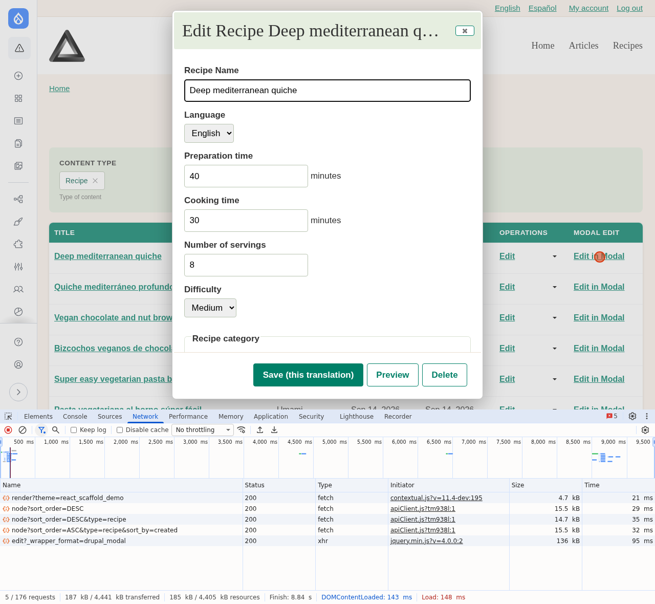
"Edit in Modal" needs permission to edit the node, log in to see it working.